
While The New York Times may be best known for its in-depth writing, we’ve been impressed with their graphical side lately – particularly the way they’ve been bringing numbers and trends to life through data visualization.
Getting the upshot
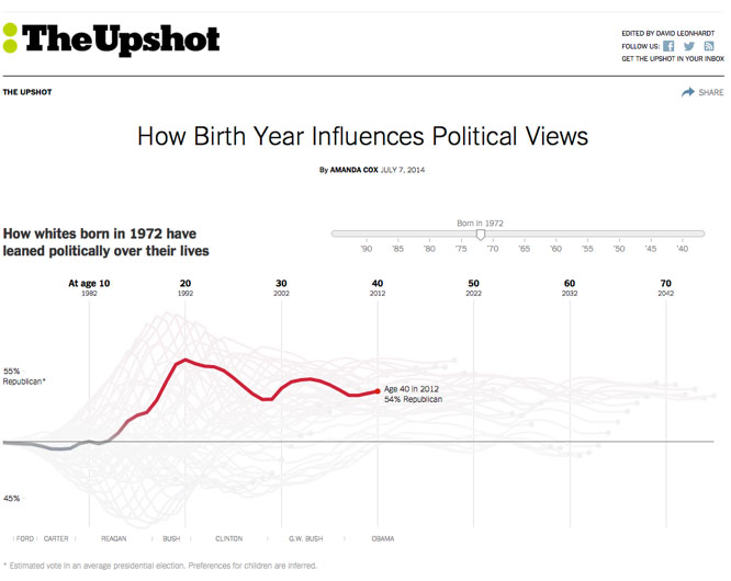
Online features of The Times like “The Upshot” often provide a revealing perspective that a simple written article could not. In the example below, for instance, an interactive slider lets you instantly see how someone’s birth year influences their political views.
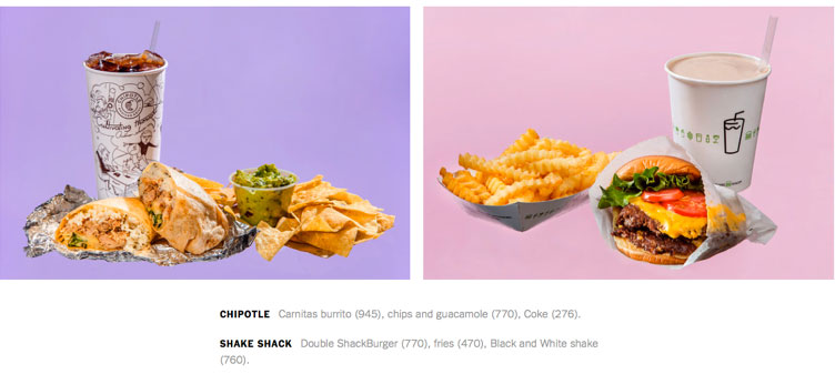
In another “Upshot,” The Times showed what 2,000 calories looks like and demonstrated how easy it is to blow your recommended daily intake on a single restaurant meal. (Curse you, Shake Shack, why must you be so close to our office?!)
Tracking topics throughout history
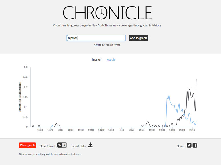
Interested in trends? The Times has a terrific tool called Chronicle, which graphs how often selected terms have been referenced in the paper over its long history. The real fun begins when you compare terms and the coverage they’ve received. As you can see, “hipsters” are, well, a lot hipper than “yuppies” right now.
In case you’re curious, the term “data visualization” has seen a spike in the last few years. That’s a trend we can wholeheartedly embrace.